

NIT Data Skills Guide Africa · 2026
Online Data Analytics Courses
in Africa
Excel → SQL → Python → Power BI → Portfolio
A practical learning path for students who want to analyse real datasets, build dashboards and finish with portfolio projects they can explain.
Beginner learning sequence
What should an online data analytics course teach?
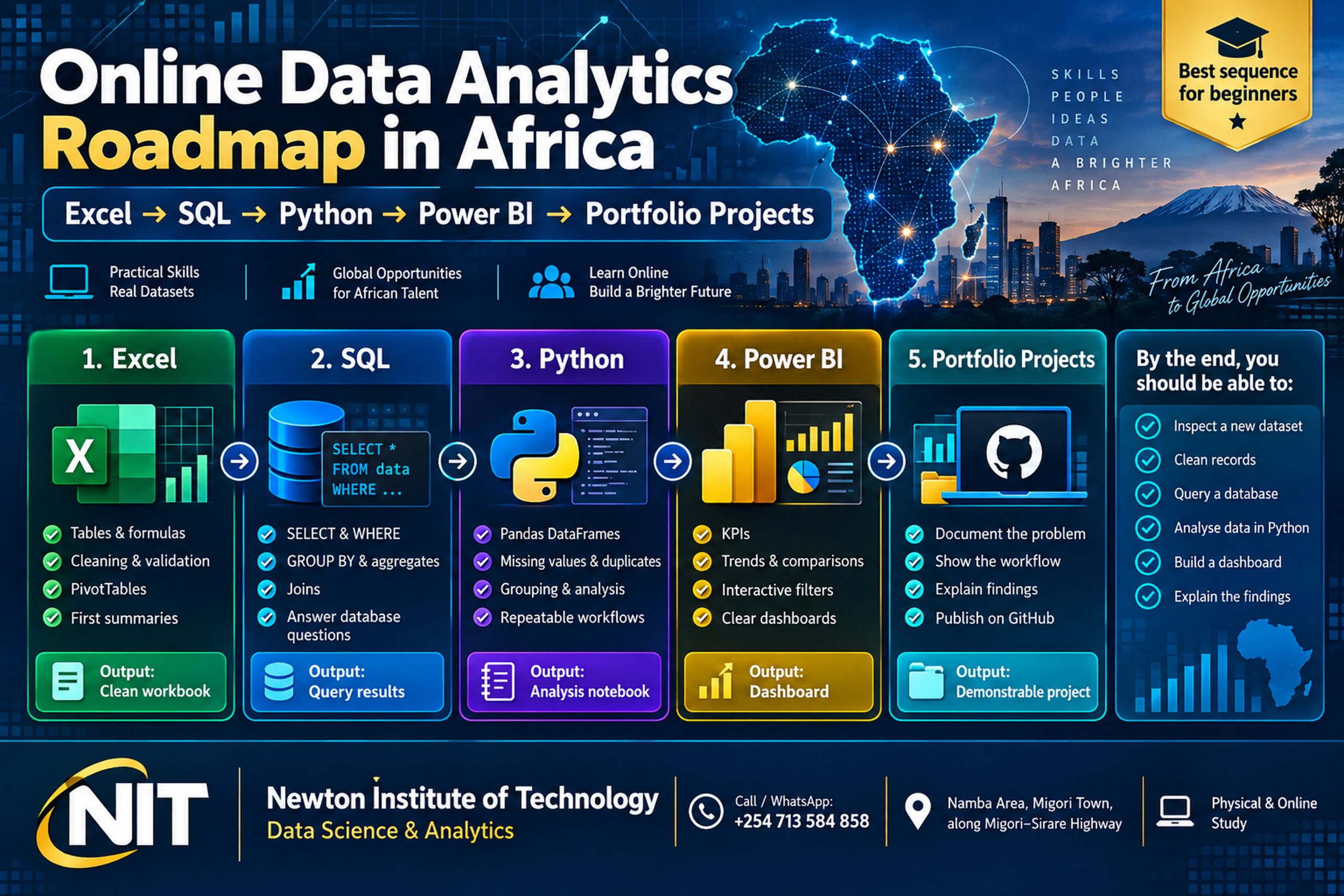
A practical course should teach you how to move from raw data to a useful conclusion. For most beginners, the clearest sequence is Excel → SQL → Python → Power BI → portfolio projects.
Excel develops spreadsheet analysis and cleaning skills. SQL retrieves structured database records. Python makes analysis repeatable. Power BI presents findings clearly. Portfolio projects connect the tools into one workflow.
Build stable foundations in spreadsheets, databases, Python and visualisation.
Clean records, write queries, analyse data and build dashboards yourself.
Document complete projects so another person can inspect your process and findings.
A useful online course is measured by what you can analyse and build, not by how many software names appear on the syllabus.
The learning process should eventually take you through a complete workflow: define the question → inspect the data → clean it → analyse it → visualise the result → explain the finding → document the project.
Newton Institute of Technology uses this practical progression in its Data Science and Analytics training, combining institutional learning, projects and a compulsory industrial attachment. See the current NIT Data Science and Analytics programme [1].
Skills map
How the main data analytics tools fit together
| Skill | Main purpose | Practical evidence |
|---|---|---|
| Excel | Clean, calculate and summarise data. | Workbook, PivotTables and analysis. |
| SQL | Retrieve and combine database records. | Queries that answer defined questions. |
| Python | Analyse and automate repeatable workflows. | Scripts and analytical notebooks. |
| Jupyter | Combine code, explanation and output. | Readable end-to-end notebook. |
| Power BI | Present trends and key indicators. | Dashboard or report. |
| GitHub / portfolio | Organise and present completed work. | Documented project repository. |
Stage 1 · spreadsheet analysis
Start with Excel: learn to inspect data before you code
Excel is a practical starting point because you can see the records while learning how tables, calculations and data quality work. Build confidence with sorting, filtering, formulas, lookups, duplicate detection, missing values, PivotTables, PivotCharts and validation.
Microsoft documents XLOOKUP as a function for finding a value in a table or range and returning the corresponding value from another field. [3]. Power Query extends this foundation with data import, preparation and transformation tools used in Excel and Power BI. [4].
Practice task
Delivery operations spreadsheet
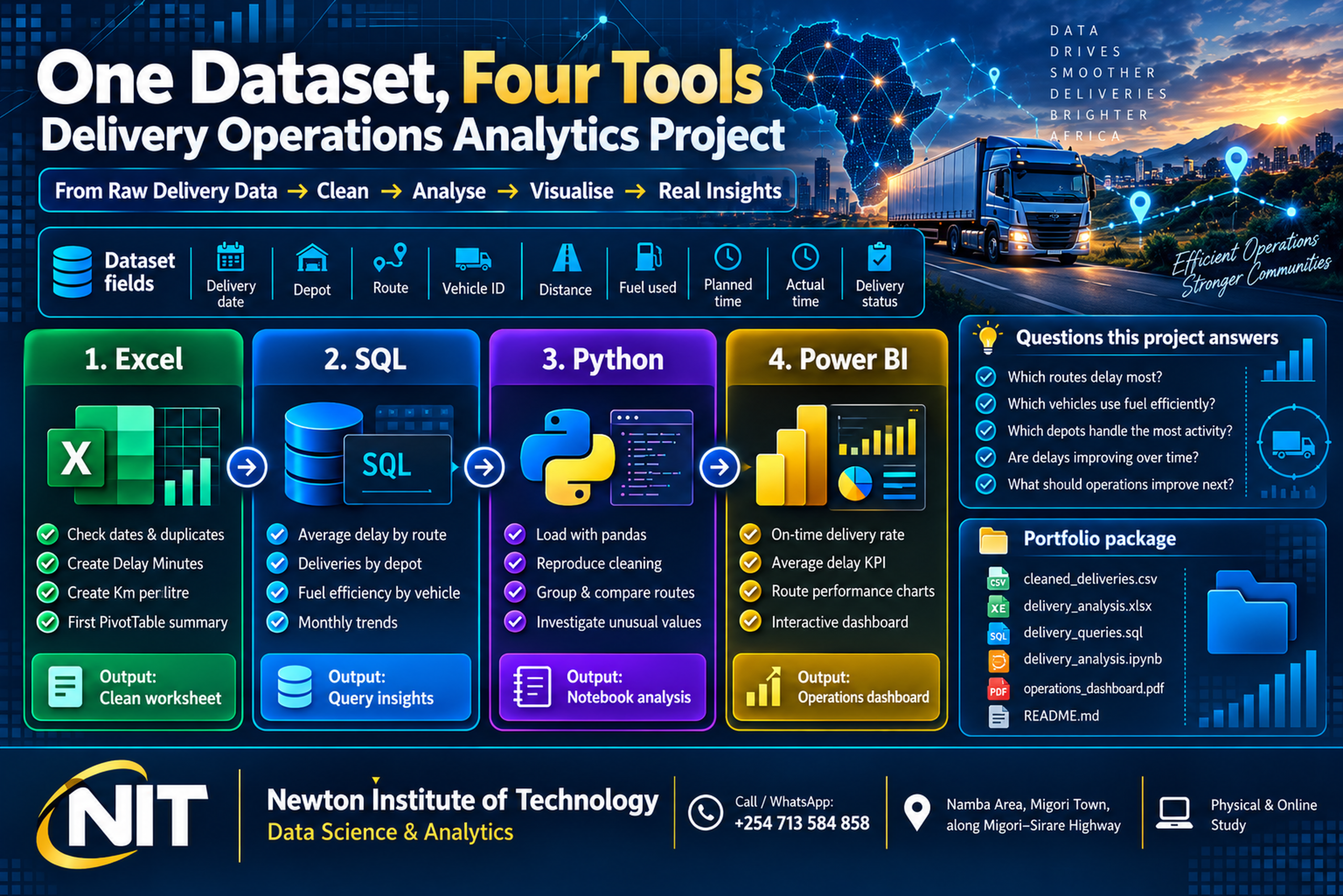
Work with fields such as delivery date, depot, route, vehicle ID, distance, fuel used, planned time and actual time.
- Check dates and duplicate delivery records.
- Confirm distance, fuel and travel-time fields are numerical.
- Create Delay Minutes = Actual Time − Planned Time.
- Create Fuel Efficiency = Distance ÷ Fuel Used.
- Use PivotTables to compare routes, depots and vehicles.
Stage 2 · database analysis
Move into SQL and ask questions directly from a database
SQL becomes important when operational information is stored in relational databases. Start with SELECT, WHERE, ORDER BY, COUNT, SUM, AVG, GROUP BY, HAVING, joins, subqueries, Common Table Expressions and window functions.
PostgreSQL’s official tutorial covers core SQL querying, while its aggregate documentation explains functions including COUNT, SUM, AVG, MAX and MIN. [5] · [6].
SQL example
Which routes experience the greatest average delays?
Load the cleaned delivery records into a deliveries table, then group the records by route and compare average delay.
- Calculate average delay by route.
- Compare monthly delay trends.
- Measure on-time delivery rates.
- Extend the query to depot activity and vehicle fuel efficiency.
Stage 3 · repeatable analysis
Add Python when the workflow needs to be repeated
Python allows a sequence of analytical steps to be written once and rerun. For data analytics, pandas is a central library. Its official documentation describes the DataFrame as a two-dimensional structure for tabular data and covers practical operations such as filtering, grouping, merging and missing-data handling. [7].
Core Python foundations
Variables, strings, numbers, lists, dictionaries, conditions, loops, functions, file handling and library imports.
Analytics foundations
DataFrames, missing values, duplicates, filtering, sorting, grouping, merging, dates, data types and exploratory analysis.
Once your code runs, inspect the result: confirm dates, investigate missing fuel values, verify duplicate records, check vehicle identifiers and understand unusual values. That verification is part of the analysis.
Stage 4 · analytical documentation
Use Jupyter to show how you reached the answer
Jupyter notebooks combine executable code, explanatory text and visual output in one document. That makes them useful for projects because the reader can follow the question, cleaning decisions, analysis and findings in sequence. [8].
State the objective and explain the important fields.
Show missing values, duplicates, corrections and calculations.
Use charts where useful, then explain what the evidence shows.
Stage 5 · dashboard communication
Build Power BI dashboards that answer clear questions
Microsoft describes a Power BI dashboard as a single-page canvas for important highlights, while reports can provide additional detail. [9].
Total deliveries, on-time rate, average delay and average kilometres per litre.
Delay by route, depot activity, monthly performance and fuel efficiency by vehicle.
Month, depot, route and vehicle filters support deeper analysis without crowding the page.
Keep the dashboard focused on the visuals that answer the defined questions. Reliable calculations come first; the dashboard then makes the result easier to understand.
Signature practical exercise
One dataset, four tools: build a complete delivery-operations project
Use one dataset throughout the learning process instead of completing unrelated software exercises. A six-month delivery dataset can contain delivery date, depot, route, vehicle, distance, fuel used, planned travel time, actual travel time and delivery status.
Check records and calculate delay minutes and fuel efficiency.
Measure delays, depot activity, fuel efficiency and monthly trends.
Automate the analysis, investigate unusual results and build a dashboard.
Questions to answer
Make the project operational
Start with a small set of questions that can be answered from the available records.
- What percentage of deliveries arrive within the planned time?
- Which routes experience the most delay?
- Which vehicles record the best fuel efficiency?
- Which depots handle the most delivery activity?
- Are delays improving or worsening over time?
Portfolio evidence
Build a portfolio while you learn
Portfolio development works best when it begins during training. A practical progression is Excel project → SQL analysis → Python notebook → Power BI dashboard → end-to-end capstone.
GitHub recommends a README so visitors can understand and navigate a repository. [10].
Explain the task
State the question, dataset and why the analysis matters.
Show the workflow
Document cleaning, SQL, Python, calculations and visualisation.
Explain the result
Connect your findings to the original question and keep files easy to inspect.
Project ideas
Five data analytics portfolio projects you can build
| Project | What to analyse | Suggested tools |
|---|---|---|
| Delivery operations | Route delays, fuel efficiency, depot activity, vehicle performance and monthly trends. | Excel + SQL + Python + Power BI |
| Small-business inventory | Fast-moving items, slow stock, stock value and reorder requirements. | Excel + SQL + dashboard |
| School performance | Subject averages, score distribution, term changes and attendance patterns. | Excel + Python + Power BI |
| Fleet maintenance | Maintenance cost, breakdown frequency, downtime and service patterns. | SQL + Python + dashboard |
| Loan portfolio | Outstanding balances, repayment patterns, branch activity and changes over time. | Excel + SQL + Python |
Choose the learning format
Three ways to study data analytics online
Recorded lessons
Works for learners who are comfortable setting their own practice schedule and checking their own progress.
Scheduled online classes
Provides live instruction, exercises, projects and feedback within a defined cohort period.
Full training pathway
Combines instructor-led curriculum, assessment, projects and progression beyond individual software lessons.
Course comparison
How to compare online data analytics courses in Africa
Many programmes list the same tools. Compare what you will actually practise and produce.
| Question | What to look for |
|---|---|
| Will I practise Excel? | Real datasets, formulas, cleaning and analysis. |
| Will I write SQL? | Regular database exercises and queries. |
| Will I use Python? | Practical notebooks and data-analysis assignments. |
| Will I build Power BI dashboards? | Reports created from data you analysed yourself. |
| Will I complete projects? | Individual work that you build and document. |
| Will I receive feedback? | Trainer review of exercises, projects and reasoning. |
| Will I create portfolio evidence? | Organised files, notebooks, dashboards and README documentation. |
| Is workplace exposure included? | Attachment or structured practical experience where offered. |

Studying from Africa
What to look for in an online learning arrangement
The technical skills remain the same whether you study from Kenya, Uganda, Tanzania, Rwanda, Ghana, Nigeria, South Africa or elsewhere in Africa. What changes is the delivery arrangement.
Before enrolment
Confirm how the course actually runs
Practical online training should make it easy to practise, submit work and get useful feedback.
- Live, recorded or blended lessons.
- Clear class timetable and trainer access.
- Assignment and project frequency.
- Software and laptop requirements.
- Project assessment and portfolio support.
- Progression after institutional training.
Newton Institute of Technology
Online Data Science & Analytics training with a practical progression
NIT’s Data Science and Analytics programme combines six months of institutional training with a compulsory three-month industrial attachment. Physical and online study options are available. The programme covers Excel, statistics, Python, SQL, data cleaning, Jupyter, Git, GitHub, data visualisation, introductory machine learning and project development. See the full current programme [1].
Excel, statistics, programming and database skills.
Clean, analyse, visualise and explain datasets.
Take the training into a real workplace environment.
Programme snapshot
6 months + 3 months
Institutional training followed by compulsory industrial attachment.
Physical & online
Flexible study arrangements with practical assignments and projects.
Workplace exposure
From training to industrial attachment
After the six-month institutional programme, NIT Data Science and Analytics learners proceed to a compulsory three-month industrial attachment. [1] The attachment provides workplace exposure to organisational records, reporting processes, deadlines, communication and practical data tasks.
NIT’s dedicated attachment guide covers placement, logbooks, workplace learning and evidence-building in more detail. Read the ICT Industrial Attachment guide [2].
Equipment baseline
Laptop requirements for online data analytics
Regular access to your own computer makes practical training easier because you need to practise between lessons. NIT currently recommends an Intel Core i5 or equivalent AMD Ryzen processor, 8 GB RAM and 256 GB SSD for Data Science and Analytics learners. NIT programme requirements [1].
A practical baseline for everyday analytics training.
Supports Excel, browsers, SQL tools, Jupyter and Power BI learning workflows.
Fast storage for software, datasets and project files.
Practical outcome
What should you be able to do after training?
Independent test
Open a new dataset and work through it systematically
Skills become useful when you can apply them without being shown every step first.
- Inspect and organise a new dataset.
- Handle duplicates, missing values and common inconsistencies.
- Create spreadsheet summaries and PivotTables.
- Retrieve and join database records with SQL.
- Analyse tabular data with pandas in Jupyter.
- Build a focused Power BI dashboard.
- Document the project and explain the findings clearly.
Frequently asked questions
Online data analytics courses in Africa: common questions
Can I learn data analytics online in Africa?
Yes. Excel, SQL, Python, Jupyter and Power BI can all be taught and practised online. Newton Institute of Technology currently offers an online study option for its Data Science and Analytics programme. See NIT programme details [1].
Should I learn Excel, SQL or Python first?
For a complete beginner, Excel is a practical first step because it introduces structured data, cleaning, formulas and summaries. SQL adds database analysis, while Python extends the workflow into repeatable, programmable analysis.
Is SQL important for data analytics?
Yes. SQL allows analysts to retrieve, filter, group and combine structured records stored in relational databases. [5].
Why is Python useful for data analytics?
Python turns analytical steps into repeatable code. Libraries such as pandas provide data structures and operations designed for tabular analysis. [7].
What projects should I put in a data analytics portfolio?
Use projects that show the full process: define the problem, inspect and clean the data, analyse it, create appropriate visualisations and document the findings. Delivery operations, inventory, school performance, fleet maintenance and loan-portfolio analysis are useful examples.
Does Newton Institute of Technology offer online Data Science and Analytics training?
Yes. NIT currently provides physical and online study arrangements for its Data Science and Analytics programme. View the current course page [1].
Admissions · Newton Institute of Technology
Register for Data Science & Analytics training
Build practical skills in Excel, statistics, Python, SQL, data cleaning, Jupyter, Git, GitHub, visualisation and project development, then progress to compulsory industrial attachment. [1]
Training pathway6 months institutional training + 3-month compulsory industrial attachment
Study & feePhysical or online · KSh 60,000 school fee · continuous admissions
Visit / callNamba Area, Migori Town
+254 713 584 858
Sources and references
[1] Newton Institute of Technology — Data Science and Analytics Course in Kenya. Current programme duration, physical and online study modes, curriculum, school fee, laptop guidance and compulsory industrial attachment.
[2] Newton Institute of Technology — ICT Industrial Attachment in Kenya. Workplace-learning, attachment preparation and evidence-building guidance for ICT learners.
[3] Microsoft Support — XLOOKUP. Official Excel documentation for lookup functionality.
[4] Microsoft Learn — Power Query. Official documentation for data connection, preparation and transformation in Excel and Power BI workflows.
[5] PostgreSQL Documentation — SQL Tutorial. Official introduction to SQL querying and relational-database operations.
[6] PostgreSQL Documentation — Aggregate Functions. Official documentation for aggregate analysis including COUNT, SUM, AVG, MAX and MIN.
[7] pandas Documentation — Package Overview. Official documentation for DataFrames and tabular data analysis in Python.
[8] Project Jupyter Documentation. Official documentation for notebook environments that combine executable code, explanatory text and output.
[9] Microsoft Learn — Power BI Dashboards. Official documentation describing dashboard structure and use.
[10] GitHub Docs — Best Practices for Repositories. Official guidance for repository organisation and README documentation.
Prepared by: Newton Institute of Technology Editorial Team
Institutional / Technical review: Engineer Simon Barongo
Last reviewed: 28 September 2026